Fear and Loathing in Auto Layout: Content Compression Resistance Priority and Constraint Priority (Xcode 7 beta 2)
Content Compression Resistance: Stop Making me Feel Small!
This post is one of a pair of posts looking at compression resistance and hugging priority. It follows yesterday's post on size classes in auto layout. As before this is a very practical example, and you will benefit by following along in your own project as you read.
2. Between them place an empty view (for which you might want to change the background colour for the sake of visibility).
3. Fix the height of the central view using the third icon along the bottom right of the storyboard pane, and adding the constraint.

4. Drag out constraints between the left button and the left side and the bottom of the superview and for the right button drag out constraints to the right side and to the bottom of the superview.
5. Connect the central view horizontally to the right button and the left button and to the bottom of the superview, so all looks like this:

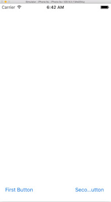
You should now see the right button is truncated in the middle when in portrait orientation if you've used a similar sized central view and text inside the buttons. If it isn't (and part of the central view is visible) then shrink the width of your central view slightly and update constraints for it. It might seem counterintuitive but by making the view smaller you make the spacing between the view and the buttons larger, which in turn increases the space between the buttons themselves (which is what we ultimately want). The view is simply performing as a spacer. The sum of the two constraints between the buttons and the view is what is important.
7. The truncation style of each button you can change in the Attributes Inspector, but more interesting to us here is that we can alter which button is being truncated. To do this select the right button and in the Size Inspector change the Horizontal value of the Content Compression Resistance Priority (or CCRP for short!) to 1000 (or any figure higher than the default, which is 750).


What we see here is that if resistance values are equal then the left button takes priority and remains the correct width but if one has a CCRP that is higher than the other then this one takes priority.
If we hover over a CCRP field (Horizontal or Vertical) we'll see some text about the Resistance Priority defining how much the view resists being made smaller, and that's precisely what the Content Compression Resistance Priority values represent. In fact, if I could rename the property, I'd probably call it 'Resistance to being made smaller'.
Constraint Priority: A Piece of Resistance
It is not only views that can have their priority set, constraints can also have their level of priority adjusted. All constraints are created equal with a priority level of 1000 (required), but if you double click on them this can be adjusted.
To demonstrate this:
1. Double click on one of the constraints between the view and one of the buttons.
2. Change the priority value to 740 or below. You will see the constraint become a dotted line.


Thanks go to József Vesza for his suggestion to include constraint priority and for ongoing feedback on this series of Auto Layout posts.
Conclusion
This has been a relatively brief post covering Content Compression Resistance in Auto Layout, which has also included use of a spacer view and an introduction to Constraint Resistance. In the post that follows tomorrow, I'll look at Content Hugging Priority.Note: Spacer views can be useful in certain situations and are included in Apple's own examples of Auto Layout.

Comments
Post a Comment