Fear and Loathing in Auto Layout: Constraint Multipliers, Ratios, Constants and Relations (Xcode 7 beta 2)
Multipliers and Ratios
Up until now the Auto Layout series of posts has been using constraints with constant widths and heights, but there is another way. This involves using multipliers, ratios and relations. In this post, I'll show you in practical terms what this means for your layout.1. To begin, add a single button to the left corner of your view.
2. Connect it to the left and bottom sides of the superview by Ctrl + dragging, and selecting the top option in the list that appears each time you let go of the drag (as we've done many times before in the previous posts).
3. Drag out a constraint to the right of the superview in the same way as point 2.
4. Double click the final constraint (connecting the button to the right of the superview) and change the value in the Constant field to zero.

With the Constant set to zero and the Multiplier set to 1, 100% or 1:1 the button will stretch the entire width of the screen.

5. Now double click on the constraint (or open the Size Inspector panel with the constraint selected) and change the Multiplier to 2, 200% or 2:1 and you will see that the button consumes roughly half the screen (excluding the margins), i.e. the constraint consumes roughly the same space as the button.

4. Double click on the constraint again (or open the Size Inspector panel with the constraint selected). Change the multiplier to 3, 300% or 3:1 and the button now consumes roughly a third of the width, i.e. the constraint consumes twice the space of the button.

In points 3 and 4, I've written roughly half and roughly a third. The reason for this is because of space consumed by the margins and how the calculations are made. (The superview is calculating its measurements "Relative to the margin" but the button is calculating its size relative to the edge of the screen.)
Making things even
If we want an actual half or third, etc. then you need to use the Size Inspector panel:1. With the constraint connecting the button to the right side of the view (and with the Size Inspector panel visible) select the "Second Item" drop down menu.
2. Now select "Relative to margin" option from the menu.

Note: If you inspect the dropdown menu for the "First Item" in the constraint relationship, you'll see that this is by default set with "Relative to margin". For further explanation of "Relative to margin" see this post.
How the Multiplier Works
To briefly explain what is happening here: the constraint looks at the entire space available and depending on the multiplier assigns a slice to the view (or in this case button) and the remaining space to itself. So 3:1 means that the available space is divided into 3 and 1 part of that space is assigned to the button. Whereas 1:1 means the space is divided into 1 and 1 part (i.e. the whole) is assigned to the button.You will notice also presets 4:3, for example, meaning that the available space is divided into four and the button is given three parts of this space. And 16:9, where the space is divided into 16 parts and the button is given 9 parts of this space. (Note: These presets are there to help size content relative to the aspect ratios of the iPad and iPhone respectively.)
For further explanation of the spacing and ratios, see Apple's overview.
Two buttons are better than one
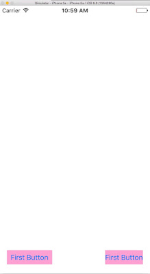
Where things get really interesting is with two buttons. If we connect a left and right button at 200%, the left button enjoys the space available at a ration of 2:1 (excluding the intrinsic size of the first button).
So what we end up with is something that behaves like this:

Constant
The purpose of the Constant can be explained fairly simply. If you access the constraint popover or the Size Inspector and enter a number in the Constant field that value will be added to the length of the space constraint. So what we were actually doing in the first posts on Auto Layout was to have a multiplier of 1, i.e. the views were being stretched across the entire screen and then a constant value was being added to the constraint in order to make the view so many points from the edge of the screen.Relations
What's slightly more complex than the Constant value is the the Relation values, so we'll look at that now:1. Either inside the Size Inspector while the constraint is selected or in the popover (using the ≤ = ≥ dropdown menu). First select the 'Greater Than or Equal' to value.

The leftmost button will shrink back to its intrinsic size. This is because we've instructed the constraint to be greater than or equal to its minimum size based on the 2:1 ratio. And if we now examine this in the iPhone simulator we'll see that this is a very useful setting:


2. Now change the Relation value to 'Less Than or Equal' to.
You will see the button expand to its former size: we are now instructing the constraint to be no longer than the size it should consume based on the 2:1 ratio. So rather than the ratio providing a minimum constraint width as it did before, it provides a maximum constraint width. The result of which is that our leftmost button starts stretching again. This is because the constraint is no longer allowed to become any wider than the 2:1 ratio (i.e. it's space must be at most equal to that of the button).

Note: If we wanted it to be the rightmost button that stretched instead of the left then we would need to lower the Horizontal value of the rightmost button's Content Hugging Priority below its default.
3. Returning the Relation value to 'Equal' we see the same results as 'Less Than or Equal' but the difference is with 'Equal' it will maintain its space come hell or high water but with 'Less Than or Equal' the constraint is able to shrink below its maximum width in order to let other views have some breathing space.
A Multiplier of Equal
This is a long post but still there's more to be written about multipliers. Rewind to when we were concerned with two equally sized views.Suppose we did something very similar with horizontal views:

What I've done here is:
1. Create constraints between the top view and the top, right and left of the superview
2. Create constraints between lower view and the left and bottom of the superview
3. Create a constraint between the lower and upper views.
4. Select both views and click on the third item along the bottom right row of icons in the storyboard pane.
5. Check Equal Heights and Equal Widths, then click 'Add 2 Constraints'.
6. Select the width constraint of the lower view and open the Size Inspector.
7. Change the multiplier value to 0.5 (or 1:2, or 50%).
The lower view will now always have a value that is half that of the one above it. Try it out!
Conclusion
In this post, I've covered the majority of angles with regard to Multipliers, Ratios, Constants and Relations. The reason I've done so at such length is because this knowledge is crucial to the employment of Auto Layout. (Using constants alone you risk becoming entangled in compromises or overusing size classes.)
Next time I'll be considering Alignment Constraints, which is yet another sophisticated way to take command of Auto Layout.

How can we use multiplier in complex UI to scale up UI content base different iphone device such as iphone 6,6 Plus,7,7 Plus,5,5s
ReplyDelete