The time has come to write about size classes in Auto Layout. This is something that previous posts have been leading up to and I think we're now ready to address this.
Alternative views
1. Place a view as usual in a view controller leaving some space at the bottom for another view.

2. Drag out constraints to make sure it resizes proportionally by linking it to each edge of the superview. (Note: If you're unsure how to do this refer to earlier posts.)
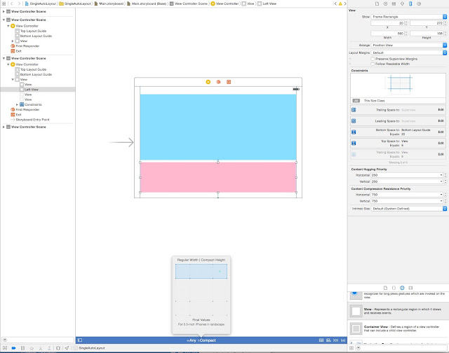
3. Now click on the words wAny hAny at the bottom centre of the storyboard pane.
4. A popover should appear with a grid inside.
5. Drag over the grid until two squares across are covered and three down, and at the bottom of the popover the text reads Base Values: For All Regular Height Layouts. Click inside the blue area of the grid.

6. Drag out a second view and place it below the first.
7. Drag out constraints from the new view to the three superview edges (bottom, left and right) and to the blue view above it. Each time selecting the top option in the box that appears when you let go of the drag.

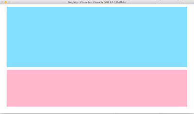
8. First build and run on an iPad, and you will see that all is fairly similar to how it appears in the storyboard. In both portrait


9. Second build and run on an iPhone. In portrait all is similar

but in landscape the lower view is not there

10. The next step is to fill the gap on wAny hCompact, to do this click on wAny hRegular and then drag out a grid that is two squares wide and one down in the popover. Click inside the blue area of the grid.

11. Now we can add (in that white space) a view that is exclusive to the compact height class.

12. Drag out constraints from the new view to the three superview edges (bottom, left and right) and to the blue view above it. Each time selecting the top option in the box that appears when you let go of the drag.
13. Build and run on an iPhone (or iPhone simulator). You should now see this when in landscape orientation:
As well as compact height restraints, it is also possible to set compact width restrains and in fact build completely different layouts for regular and compact sizes, since there is no requirement for any view to be contained in wAny hAny size class at all.
Making space for an extra one: iPhone 6 Plus
Xcode provides guidance on which devices will be served by the various choices. A compact height for example serves all iPhones in landscape (and is labelled a Base Value), while a compact height with regular width serves only 5.5 inch iPhones in landscape (and is labelled a Final Value). To examine this:
1. Click on wAny hCompact at the bottom of the storyboard pane.
2. Drag out the grid so that it is one deep and three boxes wide (and reads Final Values: For 5.5 inch iPhones in landscape). Click inside the blue area of the grid.
3. Drag the right side of the lower view to the left to make the view narrower.
4. With the lower view selected, click on the fourth icon along the bottom right of the storyboard pane and select Update Constraints (Selected Views).

5. Drag out a new view and place it into the space created.
6. Connect constraints to the top view, the lower left view, the right edge of the superview and the bottom of the superview.

7. Build and run in an iPhone 6 or lower and then on an iPhone 6 Plus. Orientating to landscape in all instances.
With the exception of the iPhone 6 Plus, you will see that no matter which iPhone you select in the simulator the lower leftmost view fill the width of the screen and that the iPhone 6 Plus now has the additional view.
Note: When the constraints for the leftmost view were updated in the context of wRegular hCompact nothing was changed in the context of wAny hCompact. If we reference this view within our ViewController file then you would also see that it is the same view (simply constrained differently). It has not been replaced by a copy or anything crazy like that. Try for example changing the background colour in viewDidLoad().
Remember the iPad remains oblivious to all of this and simply has the same views in portrait and landscape orientation that we added first of all.
Conclusion
Taking this knowledge of size classes and applying it to what has already been learnt about Auto Layout you should already have a grasp of how to control and command views (almost) at will. But there's still more to learn and more posts to follow.
Next time I will look at what is termed compression resistance before moving on to the closely related concept of content hugging.

Comments
Post a Comment